

Kelly McMahon is a celebrated illustrator and graphic designer, known for her minimalist style,
composed of sophisticated vector shapes and bold colours.Whether working as a commercial illustrator, graphic designer, or as an artist creating personal pieces,
Kelly’s designs are inspired by both an iconic sense of style and balance.Her work has been featured in collaboration with Kid Cudi’s Moon Man, Clerks III, Jay and Silent Bob Reboot,
The Massive-Verse, Rogue Sun, Radiant Pink, Deer Arrow, amongst many others.Kelly’s designs can also be seen at Gallery 1988 (LA) and Hero Complex Gallery (LA).
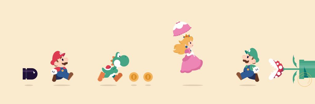
Last month, I attended Florida Supercon 2024 in the Miami Beach Convention Center. Wandering through the Artist Alley I came across the work of Kelly McMahon. Kelly’s minimalist art style with her clever use of shapes and bold colors really stood out among the many comic book and kawaii-style artists.
I was also on the lookout for some art to bring home to my girlfriend, and Kelly’s Inside Out 2 print was perfect. We had seen the movie just a few weeks earlier and loved the new emotions that were added. I really enjoy the way Kelly can break down character design into simple shapes, while also creating a complex piece of art.

I talked to Kelly a bit about her work and her journey and was instantly reminded of many of my friends from advertising school. While I studied copywriting, I made many friends who were on the art direction
(or graphic design) path.
Kelly’s style implements some of the elements I learned in the few art and design classes I added to my curriculum. Although I am a writer, I have always wanted to be more artistic.
I sent her some interview questions about her work, style, and more after the Con. You can check out her answers to those questions below:
myVGBC: Did you attend art school or are you self-taught? Do you have any mentors
or influences that helped you create your art style?
KM: I have both a diploma and bachelor in Visual Communication (Graphic Design), I started my career in Australia as a graphic designer and later pivoted into illustration.
I was lucky enough to have a teacher at university who really pushed me to explore vector illustration as a medium. He himself was a commercial illustrator and he encouraged students to dig deep into the things that excited them. No idea was ever too wild, too silly or too dull, he had a real magical way of encouraging you to better yourself and just have a go at what excited you. He reminded me once that we all start somewhere, what is wonky today can be brilliant in a year.
Be it design or illustration of the 1960’s the bold minimalist shape language and layouts of the 1960’s has always inspired my creative style. Saul Bass and Mary Blair are my two greatest influences, their bold shapes, color palettes and use of negative space have really shaped my style.
myVGBC: What’s the difference in the process when it comes to creating
for a client vs working on a personal art project?
KM: Whether I’m creating for clients or myself I tend to follow the same process. The brief is always key, it drives the research and development stage. I always start with a mood board, so I can clearly see a vision of what I’m trying to achieve. I’ll highlight any specific requests clients have and just confirm that we are all on the same page before starting the initial drafts. Even when I’m creating for myself I like to start with a moodboard to ensure I have a clear vision of my intended outcome.
From here I create my rough drafts, and refine. On many occasions it’s much simpler to work with a client, having another person weigh in can help you be more decisive on ideas. I often find I get in the weeds a little with layouts when I’m creating pieces for myself.
myVGBC: Your art style is very minimalistic. Many pieces use only a few colors.
Do you begin with simple shapes and slowly add small details?
KM: Generally speaking I start out by drawing the main subject matter or elements and build the piece from there. I’ll add and subtract the details, work on the proportions and depth of field. This stage requires a bit of back and forth to ensure that I have enough information in the piece, but also that I’m not cluttering the design. Once I have the layout locked in, then I’ll start refining the color palette and gradients.

myVGBC: For the variant cover of Moon Man #1 (by Kid Cudi), were you
given a brief, an early version of the comic, did you get to see some
artwork, or did you have to go in blind and create some different options?
KM: It differs depending on the editor / company you are working with and the job. Sometimes you get a very precise brief and other times the request can be simply to reimagine the characters and narrative in your style.

For the Moon Man issue #1 cover, the brief was to represent the character and his new found powers with a mid-century modern style. I was given inked pages of the first issue, the script as well as cover art to draw inspiration from. Coming from a design background I like as much information and inspiration as possible from clients going into the first draft. I find this helps me get a clear view of the project and reduces the refinement process.
myVGBC: Traveling from city-to-city for different Cons, do you run
into many of the same creators? Have you established a sort of
convention support group? Has it opened the door to collaborations
between you and other artists on the circuit?
KM: There is definitely some kinship in the convention circuit! I’ve been lucky enough to make some wonderful friends over the years. Having someone to chat with throughout the day and grab a drink or dinner with after the show makes the whole experience feel warmer.
I have had the opportunity to collaborate with friends I’ve made on the con circuit, sometimes a silly idea that sparks at 1 AM turns into an “ok, but for real” conversation two days later!
Working with The Massive-Verse, Galaxy Con, a number of actors and Anime Texas all came from meeting other creators or convention staff at shows. Trust is a large part of freelance and creative jobs, already knowing a freelancer or a client definitely makes a collaboration smoother.
myVGBC: You were just at San Diego Comic Con (SDCC). How does that
compare to more local conventions (like Florida Supercon)
as an artist/vendor/creator?
KM: SDCC is a very different show to most others I’ve been to. There is an unspoken focus around the ‘celebrity’ status of creators. Everyone wants to feel a part of the show, feel like their projects matters, that their creative voice matters. Everyone wants to have something to announce, take meetings, speak on a panel, or do a signing at a big booth. It’s very easy to feel lost amongst the noise.
I find at most other shows there is less focus on panels, signings, networking, and lines. You just all go about your day and enjoy the personal interactions with fans. Whilst SDCC can feel overwhelming, the show floor feels less transactional, there’s freebies and fun booth experiences and the entire city of San Diego is taken over by the show. It’s a show unlike any other!
myVGBC: You have a few Nintendo/gaming-themed art pieces.
Do you have any favorite gaming memories?
KM: For someone who grew up with games, I’m actually not much of a gamer. I enjoyed the 00’s PlayStation classics as a kid -– Croc, Tekken, Crash Bandicoot, Grand Theft Auto, Spyro, Abe’s Odyssey, etc. I have some very fond memories playing Spyro with my sister. We were fairly good at the game, but when Spyro met his untimely demise and the “Game Over” screen flashed up we would beg Dad to play the next round so we didn’t have to be responsible for killing him again.
I have a very clear memory of Dad barely stepping through the front door one night, as we shoved the controller in his face explaining that if we lost one more time Spyro wouldn’t make it! The level was so hard to pass he looked up cheats online and it resulted in a four page print out and this crazy roundabout way to get Spyro to land on this one island with the final crystal!
myVGBC: You’ve created art pieces based on Star Wars, Disney,
Nintendo, Care Bears, and many more. What are some of
your favorite established properties to work with?
KM: I’m a Disney girlie through and through, generally stories from my childhood have been my inspiration over the last few years. It’s been comforting to go back and reimagine the characters and narratives I loved as a kid. Seeing the themes through an adult lens has also been an interesting journey, it’s fascinating to see what themes you gravitated towards as a child that you are still drawn to as an adult.


myVGBC: Where does your inspiration for personal pieces come from?
Does your artist brain start going when you’re consuming entertainment
(movies, shows, games, comics, or whatever else)?
KM: My inspiration comes from everyday life. Our life experiences make up our creative pool and as someone who studied young I was shown the value of this throughout my first two years of university.
The moments that become inspiration naturally stick with you, sometimes immediately sparking an idea and other times it’s a concept you circle back on later. I actively keep my mind creatively stimulated by visiting galleries, watching movies (old and new), reading books, traveling, and seeking new experiences to ensure that I have a wealth of knowledge and visual inspiration to draw from.
As an artist I naturally filter entertainment differently, I find most of my creative friends do. We notice the lighting, color choices, story beats, and creative style. Being one step removed from work can really draw you into the material or it can quickly create a disconnect. When I really love or hate something I ask myself, why? What drew me into the material or what pulled me out of it? And how can I use these feelings in my own work.
myVGBC: You have two successfully funded Kickstarter projects —
Bad Blood and Imperium playing cards. Can you share more
about these projects?
KM: Imperium swirled around in my mind for the first part of lock down, growing from a desire to join the craze of Queen card illustrations flooding the internet at the time. A deck of cards was the perfect marriage of my graphic design and illustration skills and with not a lot going on I was intrigued by the challenge.
Initially setting out to create a traditional set of cards with my illustrative twist, I was drawn into the idea of adding more female characters to the deck. As I researched the history of playing cards, I discovered that originally the Italian decks included female Kanves (Jacks)– I thought on the concept and decided that instead of a traditional court of cards I wanted to create a Matriarch. Watching the ‘Me Too’ movement unfold made me want to celebrate women and their bravery.
Creating fourteen different characters required a little backstory for each design, the who and why really influences their outfits, hair and general look. As I was putting all that together I ended up unintentionally building out a little world and it felt like such a missed opportunity to not try and build it out further. Rachelle Heger joined me towards the end of the project and helped breathe some life into the characters and world.
The concept for Bad Blood has been on my mind since finishing Imperium. There was so much excitement for the narrative component of the project that I wanted to find a way for the story to have a stronger link to my next deck. Growing up I had a stunning picture book called “The Eleventh Hour”— the story invites readers to look for clues in the illustrations and work out who devoured the banquet before the dinner party. Thinking back on this inspired the concept of a whodunit narrative that has players searching for clues in the deck.
The 1920’s have an intrigue, an era of sin and elicit happenings, prohibition, speakeasies, luxurious parties and high stakes poker— decadent in design and narrative it felt like the perfect fit to a murder mystery setting.
I collaborated with Matt Groom and later Nick Cotton to help me build out the narrative and the game play. Once the comic script was in place Kyle Higgins, Nicoletta Baldari, and Becca Carey joined the team to help bring this sinful metropolis to life in comic form. It’s been a slightly longer journey to completion than we initially anticipated, but Bad Blood is almost ready to be shipped! I’m very excited to put it out into the world!
Imperium is currently available online and at shows. Bad Blood will also be available online and at shows as soon as the Kickstarter orders have been fulfilled.
myVGBC: I’m a big fan of artist Dave Perillo. Can you tell me about the
HONEY, I SHRUNK THE ART SHOW exhibit and how you got into that?
It sounds interesting since it features many different artists.
KM: Both Dave [Perillo] and Tom [Whalen] are such incredible artists, I’ve been a long time admirer of their work. I was really chuffed to be invited to ‘Honey, I Shrunk The Art Show’, there was such a wealth of talented artists involved.
Tom reached out earlier this year asking if I would like to join him and Dave’s latest 80’s pop culture show with G1988 and I immediately said yes! The 80’s holds a special place in my heart and I knew a show curated by Dave and Tom would be a fun one!
myVGBC: I know that many upcoming projects for artists are top secret.
Are there any sort of dream projects you’d like to work on in the future?
KM: I’m VERY excited about my upcoming run of B covers for Image Comic’s C.O.W.L. 1964. I was asked to create a series of cover designs that riffed off the original series, C.O.W.L. in 2014. The designs took the silhouette aesthetic from the original covers and leant into colorful mid-century modern pieces to adapt to the 60’s time shift in the story. I’m really proud of how these turned out!

Thank you to Kelly McMahon for her time and for answering all of these questions.
If you want to see more of her work check out her site.
Learn more about Imperium and Bad Blood.
Follow Kelly @kmmcmdraws.
